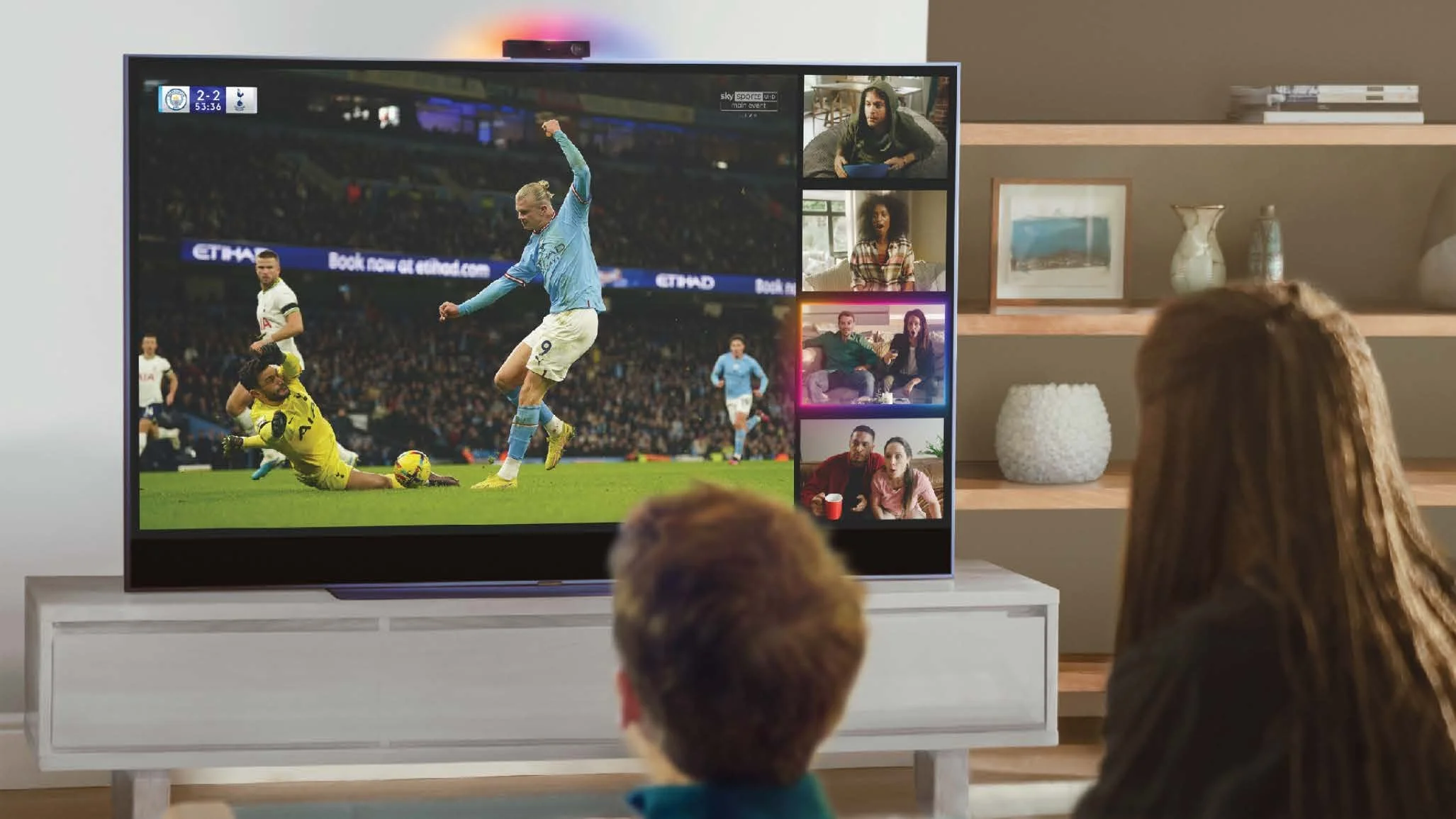
Bringing families and friends closer than ever, no matter the distance. A real-time, multi-device co-viewing experience designed end-to-end, from blank canvas to shipped product.
Outcome
Watch Together launched in June 2023 as part of Sky Live. The engagement data confirmed the core hypothesis. Usage peaks during Prime and Early Prime, exactly the evening, living-room context the product was built for. Sessions run 1 to 5 times per week, which points to purposeful social use, not casual browsing. Daily launches climbed week over week after launch.
Entry point patterns, PiP overlays, and room-code flows were adopted into the wider Sky TV design system, extending impact beyond Watch Together itself.
Influenced engineering, product, and partnerships through a clear, prioritised design vision, shaping how Sky Live evolved beyond its core camera use cases.
*Note: High-volume customer totals have been abstracted to conversion percentages to honour data privacy and NDA guidelines.
Challenge
The camera was Sky Live's differentiator, and the device proposition rested on it. Without a genuinely social use case the camera stayed underused, which made the hardware harder to justify. Watch Together was not another feature on the roadmap. It was the reason to own the device.
How might we create seamless co-viewing experiences that help households feel connected?
Research & approach
Research conducted by Sky's Global Entertainment Research team surfaced a clear emotional need: users wanted to feel present with remote family and friends, not just watch the same content simultaneously. The research identified two distinct watch-together journeys.
The content drives the occasion. Users choose a specific programme or event first, then invite others to join, such as a live match or a series finale.
The social occasion comes first. Users want to spend time together and browse or select content as a group, with connection taking priority over any specific programme.
Two goals anchored the design: make people feel present, and add to the viewing, never interrupt it.
Design process
The project evolved across three phases, each building on the last, with increasing scope and complexity. I moved from Senior UX Designer on the first MVP into a lead role as the product expanded.
Establishing the interaction model from scratch: how a TV screen becomes a shared social space. Three constraints shaped what shipped, each one a conscious trade rather than a default.
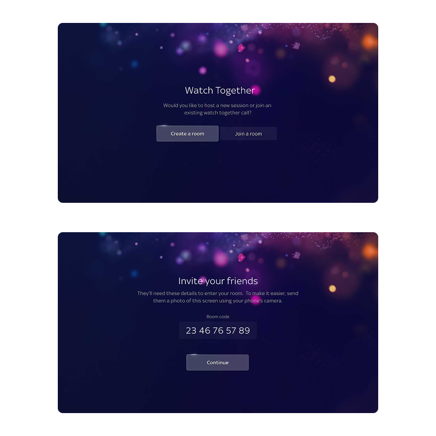
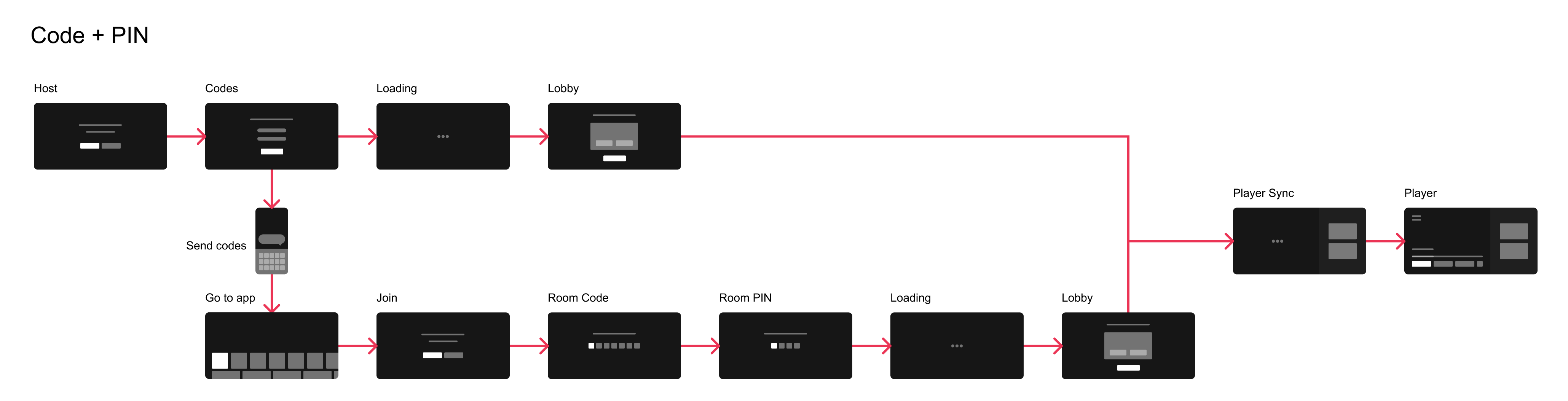
Simplified user journey of the create/join experience
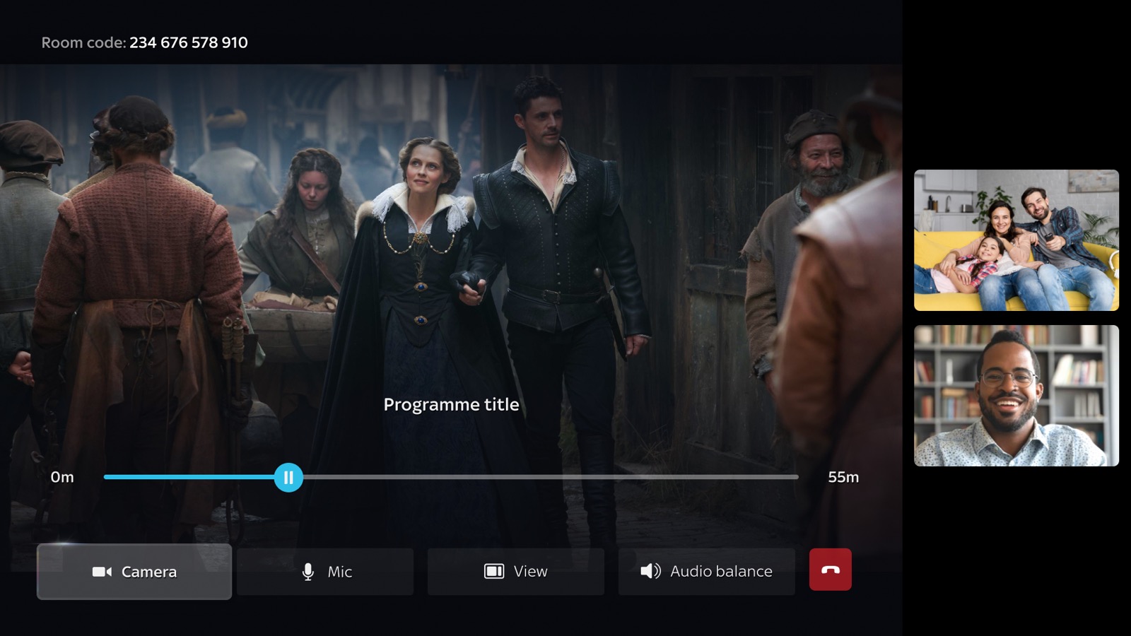
The goal was about making Watch Together feel like a native part of Sky Glass.
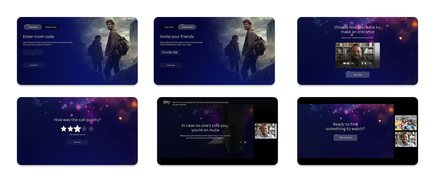
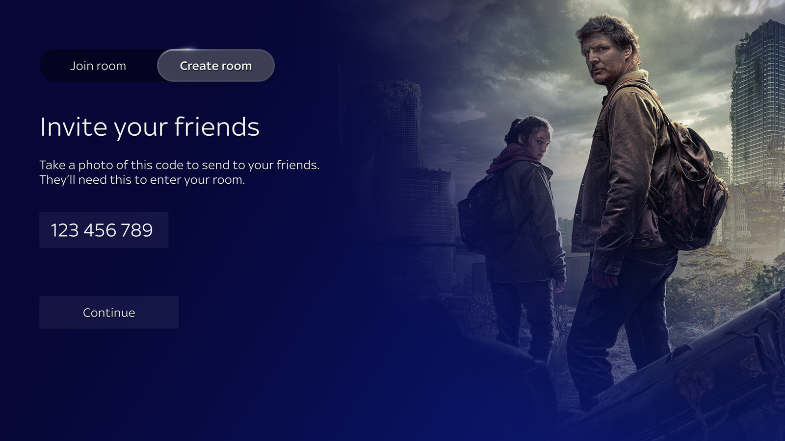
With the MVP shipped, the next goal was making Watch Together feel native to Sky Glass, not bolted on. I led design for this phase. I facilitated the collaboration with the Sky Glass team and ran weekly alignment with engineering to keep a widening scope coherent. Two focus areas:
Watch Together · Film
Reflection
Three years, three phases, five teams, one blank canvas. I led it from the first MVP through launch and into post-launch QA and iteration, turning live feedback into a prioritised backlog.
Hardware with no social precedent meant building the interaction model and the rationale behind it at the same time. No pattern to borrow, no benchmark to argue from.
Getting it shipped was its own design problem. Five teams, each with their own priorities and ways of working. The hardest constraints were rarely the technical ones.
Identity was the biggest unsolved problem: the product shipped with no concept of a persistent user, which capped how personal the experience could feel. I'd argue to bring even a lightweight version forward, a session-based screen name costs little at MVP and gives every stage after it something to build on. I'd fight for that in year one, not year three.
More work